I’m finally getting to the point – with my recent completion of a spray booth and a mainline that’s once again operational – where I want to start thinking about how I should paint CR&NW equipment for the layout. What should a modern-day Copper River & Northwestern look like?
Let’s consider what the prototype and other Kennecott roads did, and see what that might mean for the layout.
The Prototype – CRNW and Other Kennecott Railroads
The prototype CRNW vanished in 1938. Color obviously hadn’t been invented yet – I’ve seen the pictures. Okay, in all seriousness, the prototype CRNW was black steam engines with white text, and red oxide freight cars with white text. Pretty normal for a small railroad of that era that wasn’t trying to attract general business.
That was also nearly 90 years ago, when the railroad was still a Kennecott property. We’ll never know how the railroad would have progressed in the real world after everything shut down in 1938, but the CRNW wasn’t Kennecott’s only railroad. There was also the Nevada Northern out of Ely, NV; the Kennecott Chino Mines Division in New Mexico, the Kennecott Ray Mines Division in Arizona, and the various Utah lines in and around Bingham Canyon (Bingham & Garfield as well as the mine trackage). So perhaps the first thing we should look at is what happened on those railroads when they dieselized and how they started painting equipment.
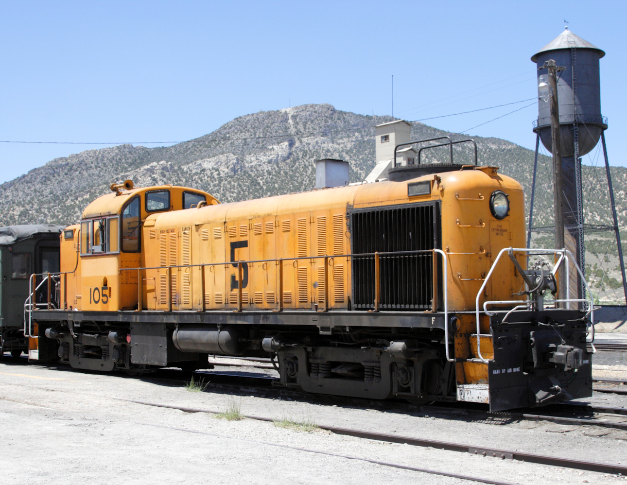
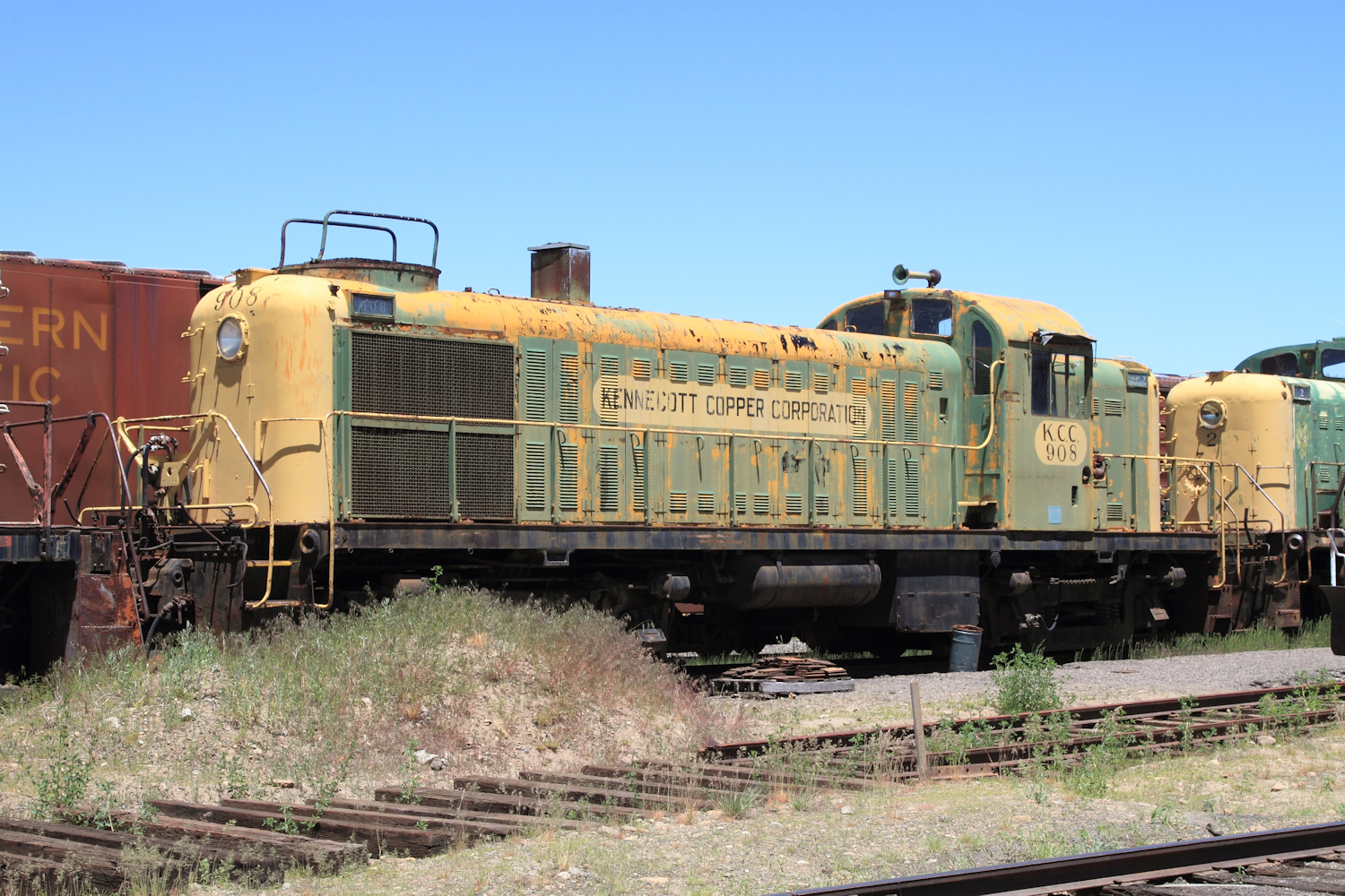
When you start looking, it’s obvious that Kennecott wasn’t any sort of artistic paint scheme wizard. The various schemes were a bit of a hodge-podge. The most prevalent was what I refer to as the “orange dip job,” which is just a solid coat of orange (or yellow, or a lot of things in between) with a big black number on the side and maybe some black text indicating which division. This was common on the early diesels – particularly the Alcos and small switchers – but also on the electrics that were used in the pit trackage in many of the mines.
Next up were the green and yellow locomotives. This paint scheme was a green body with yellow ends and lettering in yellow ovals on the sides. It appears to have been primarily applied to the SD24s and the SD40-2s, as well as some smaller power (MP15s, GP39s, some RS2s and RS3s, etc.)
From there, Kennecott applied a yellow and black scheme with a big black number on the side to their high cab GP39-2s that worked the pit in Utah. I never saw these in person, so I don’t have a photo of them. However, you can check out this one on RRPictureArchives. Definitely not going to win any design awards, but at least we’re moving in the right direction with these.
Probably the only paint scheme that I would consider “attractive” would be the final one applied to the GP39s on the Ray Mines Division down in Arizona. As far I as I know, only these three engines ever wore this particular black and yellow scheme. Again, I never saw it in person, but here’s a shot of KCC 3 by my friend Joe Blackwell.
On top of those four basic paint schemes, there were lots and lots of oddballs. Too many to cover here, and not particularly relevant anyway.
The “Modern” Copper River & Northwestern
So now that we’ve looked at what the other Kennecott railroads did as they dieselized, does that inform us about what might have happened on the CR&NW? Yes, but maybe not the way you think it would.
First, I think it’s important to consider a bigger question. Since I’m modeling the hypothetical CR&NW in present day (technically three years before present, and always in September), the first question to ask is “is it still a Kennecott railroad?” Is any of what you’ve just read relevant to the diesels that would exist in 2021?
Everywhere else that Kennecott had a railroad, they got rid of it, either by spinning it off to a shortline or by just abandoning it. The Ray Mines Division become the Copper Basin Railway in 1986. The Nevada Northern just got shut down in favor of trucks (1983) and eventually converted into a fantastic preservation railroad. The Chino Mines Division in New Mexico either was abandoned or went to Phelps-Dodge (1972) and eventually became the Southwestern Railway. The Utah Division (Bingham Canyon Mine, Magna, etc.) haulage got abandoned for trucks or conveyors (1984-2001), and the local switching operations have been contracted out since 2002. It’s pretty obvious that Kennecott didn’t want to be in the railroading business if it could get out.
Assuming that copper production continued in Alaska, my take is that the most probable outcome for the CRNW is that it would have been spun out as a shortline. Yes, it would have been heavily dependent upon ore traffic, but so is the Copper Basin, who makes most of their income doing two round trips a day between the mine and the smelter complex hauling ore trains. But it also serves as a vital all-weather link between Cordova and remote towns in interior Alaska – something that the highway system still doesn’t do today, and which probably would have helped both the region develop economically and the railroad diversify its traffic base. Certainly seems like it would be more viable as an independent common carrier than just a mining hauler.
So, the answer is probably no, in my theoretical world, it’s not a Kennecott railroad but rather a shortline created somewhere between 1984-2001. Thus, while any earlier power could still exist in KCC paint, I’m freed from the requirement of doing so and can pursue a paint scheme of my choice.
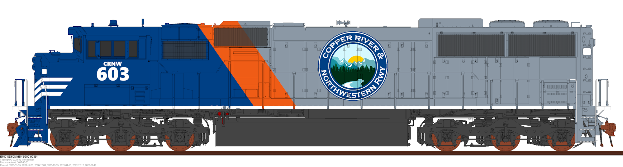
My plan for my core roster is 7 SD60Ms (phase 1a-1c, the three window versions) for primary road power and somewhere around 6 GP38-2s or GP39s for local jobs. The later would have probably been KCC leftovers, as both small GPs were common in the last days of most KCC operations. There might be plausibility to have a GP38 or GP39 still in a very weathered version of the yellow/black scheme from above running around, at least for a few years. But for the most part, I’d like everything to be clean, well maintained, and in a “modern” consistent paint scheme.
If I wanted to do a couple of the earlier Kennecott schemes, or something oddball, there’s definitely potential. Since it’s Alaska and things often escape the scrapper (just shoved where they’re not in the way), there’s plausibility for a couple derelict SD9s or other common early KCC power (RS2, RS3, RSD5) hanging around, though almost certainly not operational. Those would exist in historic KCC paint – likely orange dip on the Alcos.
Paint Inspiration
Painting equipment really hasn’t been a high priority. The layout has been too far from operational for me to get excited about it. It was more just something for idle doodling and daydreaming. But with a functional spray booth and a layout nearing operation, I figured it was time to come back to the question somewhat seriously.
Being my railroad and now having justified freeing myself from the shackles of any Kennecott prototype schemes, my first decision was that some sort of dark blue was on the palette as one of the line’s primary colors. I love dark blue. I’d paint everything dark blue if I could. Secondly, I wanted some sort of coppery orange or metallic copper paint would be the accent color as a nod to the route’s name and primary commodity. The Copper Basin has managed to use actual metallic copper paint as the accent color on their locomotives, so there is prototype precedent for doing such a thing. However, I could also just see a brilliant coppery orange being used as an easier-to-obtain, easier-to-apply color.
I’ve been kicking around a basic paint scheme for probably 6-7 years now. The original version drew heavily from the Ontario Northland’s “arrow” paint scheme except that I intended the back to be grey, the arrow to be orange or metallic copper, and the the front to be blue. The initial thought was that just “Copper River” or maybe the railroad’s full name would be on the grey part of the long hood. After tinkering with it for a while, I decided the arrow should really just be a slanted color stripe, similar CN or Ontario Northland’s previous orange/light blue/blue paint scheme. But I could never make the name look good on mockup drawings. Likewise, I couldn’t figure out exactly what I wanted to do with the nose or rear. Some sort of safety striping or something, but exactly what or what color I could never decide on.
A month or two back, I saw Hudson Bay’s new SD60Ms and something clicked in my brain. They were close enough to what I was already thinking about to confirm my idea looked good on the prototype, and offered a few solutions. The white safety stripes on the nose were a sudden “must add” to deal with the otherwise bland nose. And there it was – the solution to my problems on what do with the long hood – a big, circular logo. In the spirit of something like the old Northwestern Pacific’s “Redwood Route” logo, the Great Northern round logo with Rocky in the middle, or even Colorado Pacific’s new circular logo, that was the perfect way to get the railroad’s name on the long hood and add a bit more interest to the paint scheme.
During what I can only describe as a particularly boring meeting, I started doodling a bit more seriously in Photoshop. The logo is just a prototype – made from something I grabbed off a stock clip art search on Google and just hacked together. For that matter I’m not entirely convinced the whole paint scheme is final, but at least I have something done well now as a starting point. I’ve kicked the idea over to fellow modeler, artist, and friend Scott Thornton to allow him to ponder it. We’ll see what he comes up with. It’ll probably be way better than mine.
Thanks, of course, to Trainiax and Michael Eby for making these drawings available for us to paint. It really helps when you’ve got a quality line drawing to start with and all you want to do is doodle around.